This blog post will probably be the first of several, detailing what hasn’t worked in terms of mixing various datasets and the resulting visualisations. We learn from our (and other people’s) mistakes, as well as our successes, after all!
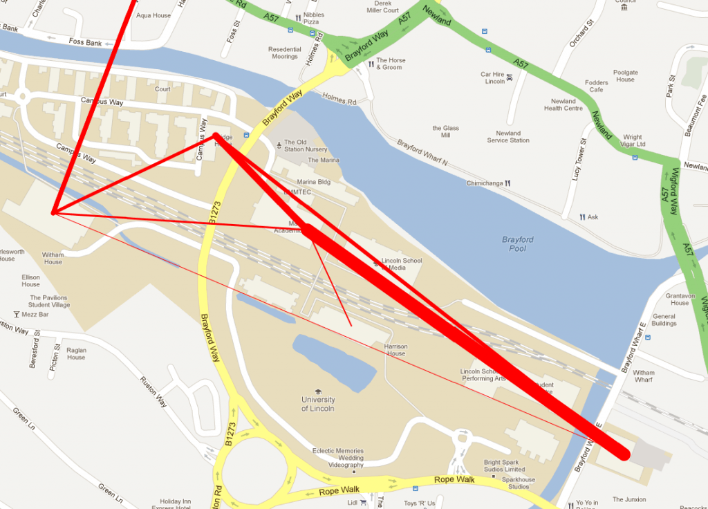
As mentioned in a previous blog posts, one of the other datasets that the University of Lincoln makes available through data.lincoln is space data – relating to rooms, buildings and campuses. As I have been able to determine which courses are offered by which departments, I decided to see how this visualisation would work when overlaid on a map of the campus. Frankly, it didn’t work very well.
Whilst knowing that various departments are sharing modules, which may show the teaching of interdisciplinary courses, is a good thing, representing this data on a map doesn’t work very well. The first problem that arose is where to situate each department. Obviously each department has a building that it is based in, but the teaching of the courses offered by the department may spread across different buildings, and even different campuses. To simplify things, I placed each department within the building in which it is primarily based. Secondly the weight of the line represents the amount of courses and/or modules being shared across departments.
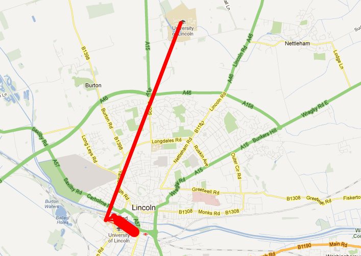
The result? A mess of lines that don’t really show anything meaningful. As staff and students won’t necessarily be involved in lectures in the building in which the department is based, it doesn’t show movement across campus or anything tangible. It’s not the buildings that are related, but the courses and modules organised and run by the people that work in the departments that are (more or less) situated, or at least based, within the buildings. Further to this, because of the nature of how close together the buildings on the Brayford campus are, mixed with the distance between the Brayford campus and Riseholme, if you zoom out to see where the red line to the left of the image above ends up, you get a line between the two campuses, and a big red blog on the Brayford campus, which makes it even more difficult to gain any information whatsoever from the visualization.
So, it is safe to say that, at least in this particular context, mixing course data with space data and overlaying it on a map doesn’t work overly well. It may be that that when combined with, perhaps, timetable data, and done on a more granular level, perhaps just showing modules within one award, that overlaying the information on a map would be more suitable; but in this particular case, the visualisation of the data leaves a lot to be desired.


How about a proportional symbol map for a particular qualification, where the size of the symbol (eg a circle) depicts the number of modules offered by that department in the qualification. This would work best with a stylised “campus map” projection that clearly identifies the different departments and draws on students knowledge of where those depts are located relative to each other and other notable landmarks?
That’s certainly one way that we could approach the data and would be interesting to see, I’ll add it to a list of things to look into. 🙂