Designing an ‘Assignment Wizard’

Before Christmas I was asking for people within the university for ideas about applications that could be developer for them, based around the concept of re-using course data that was already available.

After meeting with a member of staff from the School of Computer Science, we developed an idea around an ‘assignment wizard’, that would make use of the course data already available, such as awards, modules, assessments and staff.

The purpose of this application is to make the process of writing assignment documentation quicker, easier and more accurate. By tying the application in with assessment data, the assessment strategy delivered within the module will be identical to the strategy as defined in the validated module documents.

The expected flow of the applications is :

AssignmentWizardFlow-2
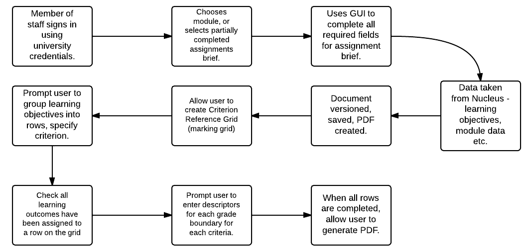
As well as reducing the amount of data that has to be entered by academics (such as learning outcomes, module details etc), the versioning and PDF generation will make the writing process more efficient. Further to this, it allows one lecturer to write a part of the assignment brief, and another to log in and complete the assignment.

A follow-up blog post will show the completed application, and start to evaluate it.

Conference Paper Accepted

Back in August, I wrote a blog post that mentioned a paper that I had submitted to The International Conference on Information Visualization Theory and Applications, titled ‘Data Visualisation and Visual Analytics Within the Decision Making Process’. I found out this week that my submission has been accepted as a short paper. It can be downloaded from the Lincoln Repository.

The (short) abstract is included below :

Large amounts of data are collected and stored within universities. This paper discusses the use of data visualisation and visual analytics as methods of making sense of the collected data, analysing it to assess the affects of historical institutional decisions and discusses the use of such techniques to aid decision making processes.

Designing a Course Finder Application

Since we now have access to a very large amount of course data, it is possible to look at ways of improving the presentation of, and access to, this data for (for example) potential students. As such, I’m looking at building a prototype ‘Course Finder’ application.

Building on my work that I outlined in my previous post, we can now identify keywords for all of the courses offered at the university. This offers one way that suitable courses that can be identified for users of the application, likely to be potential students. These courses can also be linked to JACs codes, representing the subjects covered by / in the courses. Courses are also delivered at a particular level – foundation degree, bachelors degree, masters etc.

The criteria that I am currently considering using to identify potential courses for users are: subjects previously studied;  subjects interested in and keywords (identified with Open Calais).

As well as using these parameters to produce search results, I have also included features within the application to record ‘click-through’ on search results, as well as the ability to ‘recommend’ a search result as being appropriate and relevant to the search parameters outlined above. As such, the application should ‘learn’ as more and more searches are carried out. If parameters A,B and C are specified and one of the courses recommended as being relevant, then the next time a search is carried out using parameters A,B and C, the same courses should be highlighted as being potentially more useful and relevant to the user.

Database Design

Most of the data required to execute the searches is available from our Academic Programme Management System, through our Nucleus data store. The data relating to the individual search instances, as well as recording click-throughs and recommendations will obviously need to be stored within the application’s database. It may also be necessary to locally store some of the data from Nucleus, in order to improve performance by essentially caching views on the data that are unlikely to change too often, such as links between keywords and courses.

Tables storing data locally include:

  • keyword course links
  • search instances
  • search click-throughs
  • search interests
  • search keywords
  • search studied
  • search recommendations
  • subjects
  • similar courses

The majority of the data stored in the tables listed above relates to Coursefinder-specific functionality, some data has been ‘cached’ from Nucleus, purely to save multiple API calls for data that will change very rarely.

In a follow-up post, I’ll show the created application and describe the benefits and limitations.


In Search of Similar Courses

Or, ‘How I went round and round in circles….. and then round and round some more’

One of the initial ideas that was suggested back at the beginning of the project was a way of mining course data in order to provide suggestions for similar courses. Since we now have access to the APMS data (a lot more data than my dummy set), finding ways of suggesting similar courses is now something that I can attempt properly.

The first step in the process was deciding on a method of finding keywords from within the various text descriptions of programmes and modules. OpenCalais, which has been used in a previous project at the university – JISCPress, was one such option.

OpenCalais, which has an easy to use API, takes a body of text and returns a series of keywords, broken down by type, and their relevancy score, which indicates how strongly an identified keyword is relevant to the body of text. Initially I looked at using an existing PHP library that would interface with the API (reinventing the wheel and all that), but found that they did not return all of the data I wanted in a easy to use manner, so I wrote my own code, which will be available on Github.

When I first started this process, I had access to data relating to 6436 modules of study, which are part of 878 individual programmes of study for a total of 349 courses. (If one course has two different years’ intake, it will be represented by 2 programmes. A similar situation exists with modules.)

In the first instance, I looked at generating keywords for all programmes of study (a mistake, which I cover later) and modules. I decided to use the following fields to generate keywords for programmes:

  • ‘Aims and Objectives’
  • ‘Introduction’
  • ‘Specialist Facilities’
  • ‘Career Opportunities’

I also used the ‘Synopsis’ field for modules.

This process generated 3,335 keywords, broken down into 36 types of keywords. 17,835 links were generated between programmes of study and keywords and 19,255 links between keywords and modules.

Continue reading

Making Lasagne, Not Spaghetti

The title of this blog post is taken from Noah Iliinsky’s master’s thesis and relates to designing complex diagrams that contain multiple elements, are multi-layered and well ordered, as opposed to ‘spaghetti diagrams’ that “have undefined axes, little or no order, and are a hodgepodge of similar elements”. The thesis highlights key concepts to consider when designing data visualizations and suggests a design process to use, to help create better defined and more meaningful and useful data visualizations. This blog post acts as a quick overview of some of the concepts covered in the thesis, providing a useful list of concepts to consider when designing diagrams / data visualizations. How these concepts directly apply to my work on ON Course will be outlined in a future blog post.

Firstly, how do we define what constitutes a complex diagram? Dictionary definitions don’t really help in this particular context: “The state or quality of being intricate or complicated”. Three criteria are suggested in the thesis, that may contribute towards a diagram being considered as complex.

  1. At least four different types if information to present
    Why four different types? This number was arrived at as the vast majority of visualizations encode three or fewer data types, whereas there are far fewer which encode four or greater types of data.
  2. Large amounts of information
    This concept is fairly self explanatory, if you have to present an inordinate amount of data, then whichever method of presentation you choose, it’s going to be a complex diagram.
  3. Presenting qualitative information
    Presenting qualitative information leads towards complex diagrams because of a lack of standard metaphors / representations / scales that often exist for quantitative information. As a result of this, the designer / author has to create the representative metaphor themselves, in such a way that the target audience can understand and comprehend the data being shown to them

Why be concerned with how complex a diagram is going to be? More data types to present in the visualization means that more distinct encoding methods are required. “Once the most obvious encoding has been used, the author must venture into more subtle encodings to make their points. Clearly, the more characteristics there are to be represented, the more difficult this becomes.”

Continue reading