APMS – We’re Getting Close

I haven’t blogged recently about APMS, but nevertheless there has been a huge amount of working going on to get everything ready.

A great deal of testing, bug fixing and re-testing has taken place. Last week this culminated in a full run-through of the User Acceptance Test (UAT) suite to determine how ready the system is.

This week we did a ‘technical’ launch of the live system. What this means is that our internal live server is now holding the real data, is configured for use and is being used by a small number of individuals. Those individuals are continuing to input the vast amounts of programme and module data from manual sources, and efforts are being concentrated on the versions of programmes that have been taken by those graduating this year so that their diploma supplements can be produced from the system. The task is greatly complicated by the fact that programme modifications need to be retrospectively entered into the system from the correct dates so that APMS, and subsequently graduates’ diploma supplements, contain exactly the right details about what was studied.

One of the last changes we made before the ‘technical’ launch was to include the option for different titles for earlier exit awards.  For example, for “BSc (Hons) Intergalactic Space Travel Studies”, those exiting at CertHE or DipHE levels actually get the award title “CertHE/DipHE Space Studies” (in case you’re wondering, we don’t really offer that programme).  There are still some adjustments to be made before a full-scale launch, such as getting the export format for our student management system exactly right, working out the final detail of support procedures and some tweaks to programme specifications, but things are certainly looking good. In addition to the soft launch of our live server, our internal test server also had all the live data copied to it and is now in full use for final adjustment and testing. From now on, all changes have to be made on the test server first and properly tested before being released in a controller manner to the live server.

An additional item of work that Worktribe have started on is integrating APMS with the library’s new reading list system, called Talis Aspire. We wanted to avoid academics having to maintain reading list information in two places, and Talis Aspire offers functionality never intended to be in APMS so is the obvious (and right) place for reading lists to reside. What we do need to ensure, though, is that reading lists exist and can be reviewed when programmes are proposed and changed. An additional piece of work was therefore agreed to put in place a link between the two systems.

To recap what APMS does…

  • Programme, short-course and stand-alone credit
    • Stores the details!
    • Proposal and building, including all module information
    • Approval and validation (both internal and external)
    • Modification and revalidation
    • Deletion
    • Rollover to next academic year
  • Marketing
    • Copy writing and approval
    • Information and feeds, including XCRI-CAP and XML files for use to feed our own web pages
  • External examiner reports
  • Diploma Supplement production
  • Generation of documentation and files
    • Programme and module specifications
    • Programme proposal proformas
    • Programme deletion forms
    • External Examiner report forms
    • Export to Agresso Students

When you look at that list and compare it with all the work that has been done, it seems like there isn’t as much there as you would expect. I can assure you there is a lot to it though, and it will make a significant difference to how we manage programme, module and related information.
ON Course – What’s Next?

As I haven’t posted on the blog for some time, I thought it would be useful to provide an update on progress over the past month or so, plus a preview of what I’m hoping to work on over the next few months.

Over the past few weeks I’ve written and submitted a paper to The International Conference on Information Visualization Theory and Applications. The contents of the paper follows the flow of most of my recent blog posts. Firstly, it covers the use of exploratory data visualizations in order to help make sense of large datasets. It then goes on to look at refining the data visualization process and considering the granularity of the data being presented. The final sections of the paper discuss the use of visual analytics – combining data visualization and statistical analysis, within the decision making process.

The next step for me is to look into designing and creating an application that will allow (for example) curriculum designers to view the complexity of the data available to them, as well as showing the potential impact of making alterations to seemingly small and insignificant areas of the curriculum.

As I’ve shown in earlier posts, there’s a lot of data to visualize – if you print some of the network graphs on A0 paper you can only just about make out which node represents which module, for example. As a result of this, I’d imagine that one of the main focuses of the next few weeks is finding visualization techniques and tools that will allow a lot of data to be shown to the user, but in such a way that it’s still a usable application.

As usual, I’ll be attempting to post regularly to document what I’ve been doing.


Analysing Network Visualization Statistics

As mentioned in a previous post, there are many statistics that can be derived from the network visualizations that I have been generating from the course data I have been collecting. At the moment, these are the particular numbers that I have been paying attention to:

  • Mean Degree of Nodes – The mean amount of connections per node on the graph.
  • Mean Weighted Degree of Nodes – The mean weight of connections per node on the graph.
  • Graph Density – A ratio of the number of edges per node to the number of possible edges.
  • Modularity – a measure of the strength of division of a network into modules. Networks with high modularity have dense connections between the nodes within modules but sparse connections between nodes in different modules.
  • Mean Clustering Coefficient – the degree to which nodes in the graph tend to cluster together.

So, in terms of applying these to the networks generated with awards data:

  • Mean Degree of Nodes – The mean amount of connections for each award. i.e. the mean amount of awards that each award is connected to.
  • Mean Weighted Degree of Nodes – The mean weight of connections for each award. i.e. the mean amount of modules shared by that award with other awards.
  • Graph Density – The amount of connections per award when compared to the total amount of awards in the network. (more affected by an increase in awards offered than others)
  • Modularity – a higher modularity suggests that awards are very highly connected with specific other awards, but have very few ‘odd’ connections to other awards in the network. A very high modularity would suggest that a group of awards shared a lot of modules between themselves.
  • Mean Clustering Coefficient – a low coefficient would suggest that awards did not group together, and therefore did not share modules between them. A high coefficient would suggest that most of the awards in the network formed clusters with other awards.

The numbers generated for the weighted connections between awards for the academic year 2006/07 through to 2012/13 are as follows:

Academic Year Mean Degree Mean Weighted Degree Graph Density Modularity Mean Clustering Coefficient
2006 – 2007 0.804 1.821 0.069 0.657 0.357
2007 – 2008 0.763 1.711 0.041 0.726 0.408
2008 – 2009 0.500 1.324 0.030 0.588 0.224
2009 – 2010 0.405 1.432 0.023 0.574 0.124
2010 – 2011 0.720 1.880 0.029 0.777 0.212
2011 – 2012 0.716 2.486 0.020 0.810 0.259
2012 – 2013 0.651 4.349 0.021 0.847 0.267

So what do these numbers show and are they actually useful? Well….

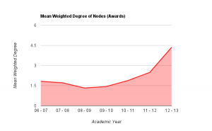
Mean degree shows the amount of awards that each award is connected to, on average. If we look at mean weighted degree instead, we then take into consideration the weight of a connection between a pair of nodes, i.e. the amount of joins between them, rather than just the fact that a join exists. Plotting this graphically helps to show the pattern that emerges.


Mean weighted degree of awards, 2006/07 - 2012/13

From the graph above it becomes clear that there is a definite drop on MWD (mean weighted degree) from the academic year 07/08 to the year 08/09 (around 22%), showing that the average amount of links between awards dropped fairly considerably. Through looking back at the university’s history, this can be explained as this was the point in time that the amount of points per module of study was altered, meaning that, essentially, multiple version of the same award were running in tandem: some with the old weighting of awards, some the new. This also explains the steady increase in MWD up to 11-12 which is the first year that the old weighted degrees would not have been active at all. From the highest point of the old weighting, to this point in the new weighting, there is an increase of over 36% in the amount of joins between awards offered at the university. This shows that (assuming an increased modularity is good in terms of curriculum design) that the provision has been improved through the alteration of module weightings. Taking into account the overall increase in the amount of awards offered, this also shows that the restructuring of the modules had a significant impact on the sharing of teaching and assessment across different awards.

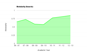
The number given for the ‘modularity’ of the graphs shows a couple of interesting things.

Modularity values for awards, 06-07 to 12-13

As noted above, the modularity shows how well the nodes on the graph (i.e. the awards) form into self contained clusters. A value of 1 would suggest that the awards form perfectly into self-contained clusters, having lots of connections between themselves but no connections with other clusters, a value of 0 would suggest the opposite. As you can see from the graph above, in 06/07, the modularity was reasonably high, quite possibly due to the smaller amount of awards offered at the university. This figure rises over the next year, and then drops for two consecutive years as the weighting of modules at the university goes through a period of change. As the change is fully implemented, the modularity rises significantly and continues to rise, almost at a constant rate from 2010-11 through to 2012-13. This would suggest (though is not necessarily the case) that, either by design or good fortune, the awards offered at the university are starting to form into self-contained groups or areas of specialism. This is interesting to note, as the university has recently gone through an organizational restructuring whereby three colleges were formed – could these clusters be contained within the colleges?

Though this has only looked at two series of numbers generated for each of these visualizations, it does show that visualizing course data produces extra data that cannot be collected when the data is in its raw form. Further to this, it also shows that this data accurately reflects historical changes in provision within the university. If these principles can be applied retrospectively to show changes, in which ways can they be applied to decision making processes, to help assess the impact of potential changes?

Dev8eD and the XCRI Course Aggregator

On the 29th and 30th of May I attended the dev8eD conference in Birmingham, which was organized for ” …developers, educational technologists and users working throughout education on the development of tools, widgets, apps and resources aimed at staff in education and enhancing the student learning experience.”

There was several organised sessions that were of direct relevance to the ON Course project, including sessions on XCRI-CAP and the XCRI-CAP Aggregator currently being developed.

One of the challenges at dev8eD was to make use of the data available through the XCRI-CAP Aggregator and present it in useful / meaningful / interesting ways; with some help from Dale Mckeown who also works the University of Lincoln, I created a mashup of data from multiple sources to make a rudimentary course search engine.

The mashup uses data from the course aggregator (currently searching only by keywords) with geo-location data, university league table data and pub location data. The course finder also links to local crime data for institutions and ‘cost of living’ data. These latter two data sources were used to show how external data sets can be used to enrich the searching experience, providing further context for the wider surroundings and environment of universities.

When more XCRI feeds are added to the aggregator, the quality and quantity of data available through the aggregator’s API will obviously increase, meaning that such a search engine would become more useful. In its current state, the website acts as a good prototype for search functionality, and also demonstrates the potential for ‘mashing up’ XCRI data with numerous other datasets.

The code (such as it is) for the website is available on Github.

APMS Rollover (and an update)

Rollover

In the current ‘manual’ portfolio of definitive programme and module information, a programme specification exists in its approved state until it is either changed or archived. (It can also be revalidated if not changed for some time, to make sure it is still up to date and valid). A programme can, in theory, go a number of years without change.

Things need to work a little differently in the APMS for two main reasons:

  1. Versions of a programme need to be carefully managed when proposing changes to that programme to be delivered in future academic years.
  2. Agresso Students (the University’s student management system) needs both ‘static’ (unchanging across academic years, delivery modes and sessions) and ‘sessional’ (unique per academic year, delivery mode and session combination) versions of a programme. These need to be output from APMS and imported into Agresso Students.

As a result, there will be a need to roll-over programmes, including their modules and all associated modules, from one academic year to another. Taking a new 3-year undergraduate programme starting in 2012/13 as a phased introduction as an example, for the cohort enrolling in 2012/13 level 1 will be delivered in 2012/13, level 2 will be delivered in 2013/14 and level 3 will be delivered in 2014/15. When that programme is rolled-over to the next academic year (2013/14), for the cohort enrolling in 2013/14 level 1 will be delivered in 2013/14, level 2 will be delivered in 2014/15 and level 3 will be delivered in 2015/16.

In a normal modification or revalidation situation for the example programme, the modification will be made to a future academic year version of that programme once it has been rolled-over in APMS. So for example, in December 2012 the delivery team may decide to swap one of the level 1 modules for the 2013/14 cohort. The programme would be rolled-over and the modifications then made to the 2013/14 version of the level 1 module(s) and programme.

This all sounds much more complicated when trying to explain it in writing than it will be in operation! And of course a Quality Officer from the Office of Quality, Standards and Partnerships will be available to guide people through the process and offer advice.

Update

Between the project team, the Communications Development & Marketing Department (which I’ll call the Marketing Department for short) and Worktribe, we have now worked out how marketing information about programmes will be stored in the system, maintained and made available to be published on the Univerity’s website. There will be a tab on a programme record in APMS for marketing information. The academic proposing the programme will be able to enter the marketing copy and information, which is split into quite a number of fields to allow it to be presented appropriately on the website, into a marketing record on that tab and start a workflow that sends it to the Marketing Department. The Marketing Department will be able to review and suggest amendments as appropriate, and also add certain information that the proposer will not know. At the end of the workflow the marketing information is approved and will then be output, in XML files, to a shared location. The website content management system (CMS) will pick up these XML files and use the content within the programme pages on the website. There is some manual work I haven’t gone into detail about, such as APMS notifying the web team in the Marketing Department that a new programme has been created because they need to manually create the basic page on the CMS. We’ve seen the first iteration of this from Worktribe and work to get it finished is going well.

Workflows to handle programme modifications and revalidations have been developed, and after some final adjustment will be complete. For those that might not know, and at a very basic level, a programme modification allows some changes to a programme and its modules, but for more extensive changes a revalidation is needed. A revalidation basically sends a programme through the same (or at least very similar) process to that when it was originally validated as a new programme. The workflows do not change the fundamental regulations about changing programmes, which will be familiar to programme leaders, but help to improve information flow, progress tracking and make things simpler.

Worktribe has also made the first iteration of the tools to delete/archive programmes that are no longer running, which we have tried out. Again, the fundamental principals do not change but we of course need a way of doing it in APMS. The basic outline is in place, and after some updates by Worktribe should be done.

The APMS project board asked for External Examiner reports to be included in the system. These reports are currently submitted by using a form on the University’s portal site, but the board felt that since they are integral to programme management they should be incorporated into APMS. The team tested the first version of this functionality today, and it’s looking good. We came up with a few suggestions for the next iteration, and there are some field changes and template design to come, but it should be a good way of getting reports from external examiners. The inclusion of external examiners in the system also means they can approve programme modifications electronically using APMS – another benefit.

Finally, Worktribe has been busy programming for the system integration elements. We now have functionality to get outputs from APMS of curriculum information that can be imported into Agresso Students to avoid having to re-key information and set up programmes and modules where it can be avoided. We also have the facility to (currently manually, but this will change) get an XCRI-CAP file out of APMS which will eventually form a new XCRI-CAP feed on our University website. After some final tweaks and development work, this will be complete.

As you can tell from all of the above, this is a particularly busy and hectic time, but it’s very positive seeing the substantial progress being made.