As mentioned in a previous post, there are many statistics that can be derived from the network visualizations that I have been generating from the course data I have been collecting. At the moment, these are the particular numbers that I have been paying attention to:
- Mean Degree of Nodes – The mean amount of connections per node on the graph.
- Mean Weighted Degree of Nodes – The mean weight of connections per node on the graph.
- Graph Density – A ratio of the number of edges per node to the number of possible edges.
- Modularity – a measure of the strength of division of a network into modules. Networks with high modularity have dense connections between the nodes within modules but sparse connections between nodes in different modules.
- Mean Clustering Coefficient – the degree to which nodes in the graph tend to cluster together.
So, in terms of applying these to the networks generated with awards data:
- Mean Degree of Nodes – The mean amount of connections for each award. i.e. the mean amount of awards that each award is connected to.
- Mean Weighted Degree of Nodes – The mean weight of connections for each award. i.e. the mean amount of modules shared by that award with other awards.
- Graph Density – The amount of connections per award when compared to the total amount of awards in the network. (more affected by an increase in awards offered than others)
- Modularity – a higher modularity suggests that awards are very highly connected with specific other awards, but have very few ‘odd’ connections to other awards in the network. A very high modularity would suggest that a group of awards shared a lot of modules between themselves.
- Mean Clustering Coefficient – a low coefficient would suggest that awards did not group together, and therefore did not share modules between them. A high coefficient would suggest that most of the awards in the network formed clusters with other awards.
The numbers generated for the weighted connections between awards for the academic year 2006/07 through to 2012/13 are as follows:
| Academic Year | Mean Degree | Mean Weighted Degree | Graph Density | Modularity | Mean Clustering Coefficient |
| 2006 – 2007 | 0.804 | 1.821 | 0.069 | 0.657 | 0.357 |
| 2007 – 2008 | 0.763 | 1.711 | 0.041 | 0.726 | 0.408 |
| 2008 – 2009 | 0.500 | 1.324 | 0.030 | 0.588 | 0.224 |
| 2009 – 2010 | 0.405 | 1.432 | 0.023 | 0.574 | 0.124 |
| 2010 – 2011 | 0.720 | 1.880 | 0.029 | 0.777 | 0.212 |
| 2011 – 2012 | 0.716 | 2.486 | 0.020 | 0.810 | 0.259 |
| 2012 – 2013 | 0.651 | 4.349 | 0.021 | 0.847 | 0.267 |
So what do these numbers show and are they actually useful? Well….
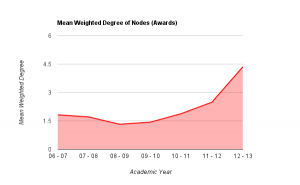
Mean degree shows the amount of awards that each award is connected to, on average. If we look at mean weighted degree instead, we then take into consideration the weight of a connection between a pair of nodes, i.e. the amount of joins between them, rather than just the fact that a join exists. Plotting this graphically helps to show the pattern that emerges.

From the graph above it becomes clear that there is a definite drop on MWD (mean weighted degree) from the academic year 07/08 to the year 08/09 (around 22%), showing that the average amount of links between awards dropped fairly considerably. Through looking back at the university’s history, this can be explained as this was the point in time that the amount of points per module of study was altered, meaning that, essentially, multiple version of the same award were running in tandem: some with the old weighting of awards, some the new. This also explains the steady increase in MWD up to 11-12 which is the first year that the old weighted degrees would not have been active at all. From the highest point of the old weighting, to this point in the new weighting, there is an increase of over 36% in the amount of joins between awards offered at the university. This shows that (assuming an increased modularity is good in terms of curriculum design) that the provision has been improved through the alteration of module weightings. Taking into account the overall increase in the amount of awards offered, this also shows that the restructuring of the modules had a significant impact on the sharing of teaching and assessment across different awards.
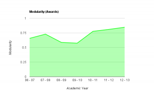
The number given for the ‘modularity’ of the graphs shows a couple of interesting things.

As noted above, the modularity shows how well the nodes on the graph (i.e. the awards) form into self contained clusters. A value of 1 would suggest that the awards form perfectly into self-contained clusters, having lots of connections between themselves but no connections with other clusters, a value of 0 would suggest the opposite. As you can see from the graph above, in 06/07, the modularity was reasonably high, quite possibly due to the smaller amount of awards offered at the university. This figure rises over the next year, and then drops for two consecutive years as the weighting of modules at the university goes through a period of change. As the change is fully implemented, the modularity rises significantly and continues to rise, almost at a constant rate from 2010-11 through to 2012-13. This would suggest (though is not necessarily the case) that, either by design or good fortune, the awards offered at the university are starting to form into self-contained groups or areas of specialism. This is interesting to note, as the university has recently gone through an organizational restructuring whereby three colleges were formed – could these clusters be contained within the colleges?
Though this has only looked at two series of numbers generated for each of these visualizations, it does show that visualizing course data produces extra data that cannot be collected when the data is in its raw form. Further to this, it also shows that this data accurately reflects historical changes in provision within the university. If these principles can be applied retrospectively to show changes, in which ways can they be applied to decision making processes, to help assess the impact of potential changes?