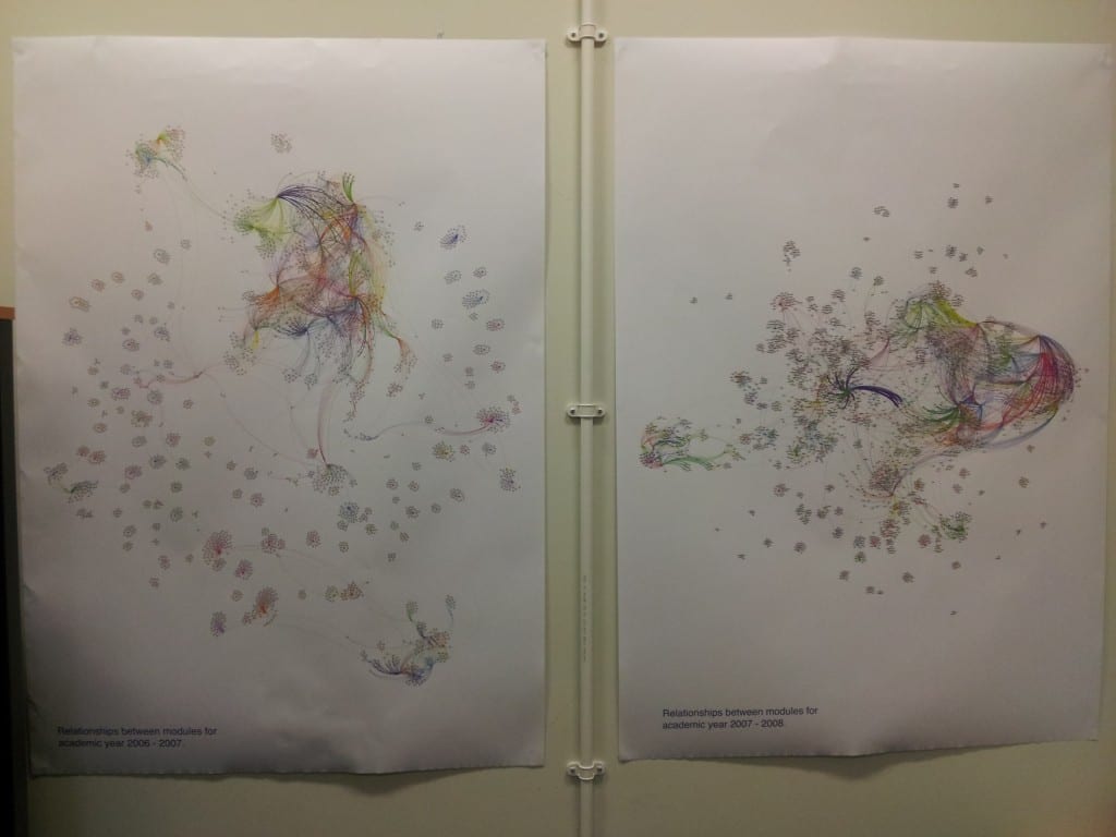
After asking colleagues in Planning, I came across some stored reports that contain information about the various awards/courses offered at the university, along with the modules that constitute those awards – from short certificates to full undergraduate and postgraduate degrees. Whilst the reports date back to the 90s, the data within them is substantial enough to be used from 2006-07 onwards; in total this comes to around 50,000 individual award->module relationships spread over the 6 academic years represented in the data.
The first question that arose was: ‘What to do with six years of course data?!?!?!’.
After speaking with Tony Hirst last week, we came to the conclusion that this data would also have a great benefit if utilised in new ways within the university itself, as well as presenting the course information (and related datasets) to current and prospective students. The first way I decided to look at all of this information was to visualise the relationships between modules and courses offered at the university.
The data shows how different awards share certain modules in common; this can be seen in small-scale examples within the raw data itself, but how would the entire dataset for a year look? To find out, I extracted the pertinent information from everything that was currently being stored, and eventually narrowed it down to a set of data that showed the relationships between modules – basically pairs of modules offered on the same awards. Modules formed the nodes of the graph and the links between the nodes – the edges, are representative of the various courses that the modules are offered on.
With this dataset prepared, I loaded the data into Gephi, selected an appropriate layout algorithm and let Gephi work its magic. As a result, we get graphs like this: allmodules_11_12. (Each node is a module, each edge is an award that the module is available on, edge colours represent a single award). From these graphs we can see that clusters of courses form that share many modules in common, mainly around joint degrees (which makes sense!); we can also see that many courses ‘float away’ from these hubs as they are entirely self contained and share no modules with any other award offered at the university. The other graphs can be seen here: all modules 06 07, all modules 07 08, all modules 08 09, all modules 09 10 and all modules 10 11.
So apart from making pretty pictures with course data, what purpose has this served? Well, firstly, I now know that I can get a vast amount of data covering the past six years of course and modules offered at the university. Secondly, I now have a better understanding of the inner workings of Gephi, which will no doubt serve me well over the rest of the project. Thirdly I also now know just who to pester in the right departments to get even more data. Finally…..we now have A0 printouts of these graphs plastered around the office walls – I certainly didn’t envisage using course data as wallpaper when I started on this project.
Being able to quickly see the connections between modules, particularly where one module is used for multiple awards could be very useful for those involved in curriculum planning. Obviously I’m not suggesting that they consult one of these A0 posters to assess the impact of changing one module, but being able to quickly find the impact of changing it would be useful. Take for instance, a module that contains an element of group work. 5 courses use this module, 4 of which are run by one particular college, the 5th course is run by a completely separate college. 4 of the courses have far too much group work, it is decided, so the decision is made to remove the group work element from the module. Do those involved in the decision know that the module is used by a course in College B, and, that the module is the only element of group work within a year’s study on the course? Removing the group work element would mean that the course doesn’t contain all of the required elements to be re-validated, obviously causing problems further down the line. Combining the data used to produce the visualisations above, along with other datasources could help to resolve this issue.
So where to go from here? Well, abstracting slightly further from the course->module level, we (I) can start to compare inter-departmental and inter-disciplinary sharing of modules at a department, faculty or college level within the university. Combining with other data that we make available through data.lincoln, we can look at how departments share modules across the physical space of the campuses that make up the university (more on that in another blog post). Combining the data with student numbers, we can look at the subscription levels to the modules that form a focal point to multiple awards. If / when I can get hold of full datasets for learning outcomes & module descriptors, I can start to look at modules that don’t necessarily share any course in common, but may be similar in terms of the learning outcomes they address or the topics they cover (as described in the module descriptions). There really are many ways to combine all of the information that I’m starting to stumble across and it is just a case of finding interesting combinations of datasets and assessing how useful the results are.
As a result of this digging around and tidying up of various data sources, all of the data that can be made accessible through data.lincoln will be made available – in a nice format, unlike the multitude of document types and messy data that I’ve been dealing with recently.
Any suggestions of ways to mash-up some data or ideas about new visualisations, feel free to leave me a comment or three below!
