How Not to Visualize Course Data

This blog post will probably be the first of several, detailing what hasn’t worked in terms of mixing various datasets and the resulting visualisations. We learn from our (and other people’s) mistakes, as well as our successes, after all!

As mentioned in a previous blog posts, one of the other datasets that the University of Lincoln makes available through data.lincoln is space data – relating to rooms, buildings and campuses. As I have been able to determine which courses are offered by which departments, I decided to see how this visualisation would work when overlaid on a map of the campus. Frankly, it didn’t work very well.


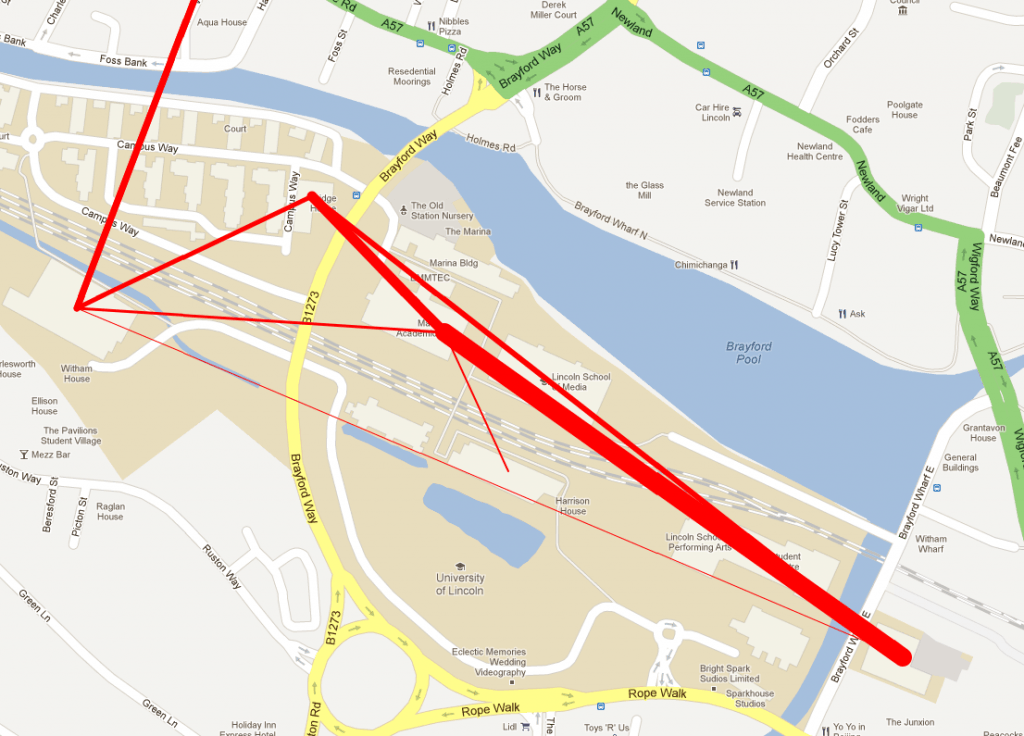
Map showing sharing of modules across campus

Whilst knowing that various departments are sharing modules, which may show the teaching of interdisciplinary courses, is a good thing, representing this data on a map doesn’t work very well. The first problem that arose is where to situate each department. Obviously each department has a building that it is based in, but the teaching of the courses offered by the department may spread across different buildings, and even different campuses. To simplify things, I placed each department within the building in which it is primarily based. Secondly the weight of the line represents the amount of courses and/or modules being shared across departments.

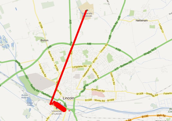
The result? A mess of lines that don’t really show anything meaningful. As staff and students won’t necessarily be involved in lectures in the building in which the department is based, it doesn’t show movement across campus or anything tangible. It’s not the buildings that are related, but the courses and modules organised and run by the people that work in the departments that are (more or less) situated, or at least based, within the buildings. Further to this, because of the nature of how close together the buildings on the Brayford campus are, mixed with the distance between the Brayford campus and Riseholme, if you zoom out to see where the red line to the left of the image above ends up, you get a line between the two campuses, and a big red blog on the Brayford campus, which makes it even more difficult to gain any information whatsoever from the visualization.

So, it is safe to say that, at least in this particular context, mixing course data with space data and overlaying it on a map doesn’t work overly well. It may be that that when combined with, perhaps, timetable data, and done on a more granular level, perhaps just showing modules within one award, that overlaying the information on a map would be more suitable; but in this particular case, the visualisation of the data leaves a lot to be desired.

What to Do with Six Years of Course Data?!?!

After asking colleagues in Planning, I came across some stored reports that contain information about the various awards/courses offered at the university, along with the modules that constitute those awards – from short certificates to full undergraduate and postgraduate degrees. Whilst the reports date back to the 90s, the data within them is substantial enough to be used from 2006-07 onwards; in total this comes to around 50,000 individual award->module relationships spread over the 6 academic years represented in the data.

The first question that arose was: ‘What to do with six years of course data?!?!?!’.

After speaking with Tony Hirst last week, we came to the conclusion that this data would also have a great benefit if utilised in new ways within the university itself, as well as presenting the course information (and related datasets) to current and prospective students. The first way I decided to look at all of this information was to visualise the relationships between modules and courses offered at the university.

The data shows how different awards share certain modules in common; this can be seen in small-scale examples within the raw data itself, but how would the entire dataset for a year look? To find out, I extracted the pertinent information from everything that was currently being stored, and eventually narrowed it down to a set of data that showed the relationships between modules – basically pairs of modules offered on the same awards. Modules formed the nodes of the graph and the links between the nodes – the edges, are representative of the various courses that the modules are offered on.

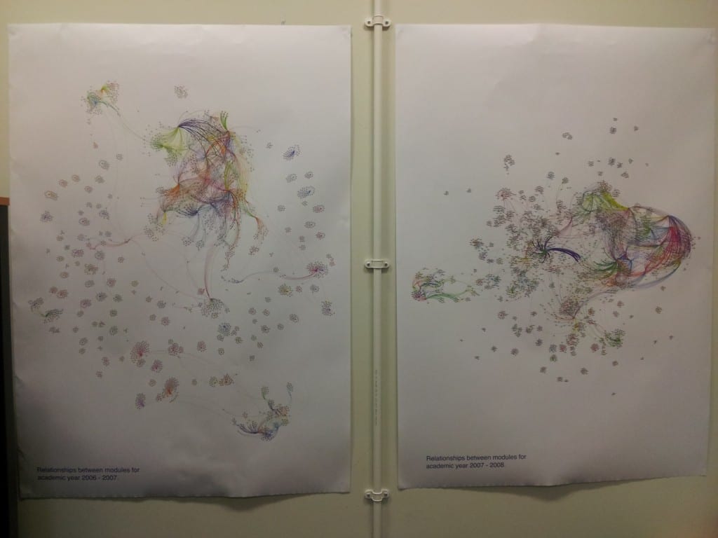
With this dataset prepared, I loaded the data into Gephi, selected an appropriate layout algorithm and let Gephi work its magic. As a result, we get graphs like this: allmodules_11_12. (Each node is a module, each edge is an award that the module is available on, edge colours represent a single award). From these graphs we can see that clusters of courses form that share many modules in common, mainly around joint degrees (which makes sense!); we can also see that many courses ‘float away’ from these hubs as they are entirely self contained and share no modules with any other award offered at the university. The other graphs can be seen here: all modules 06 07all modules 07 08all modules 08 09all modules 09 10 and all modules 10 11.

So apart from making pretty pictures with course data, what purpose has this served? Well, firstly, I now know that I can get a vast amount of data covering the past six years of course and modules offered at the university. Secondly, I now have a better understanding of the inner workings of Gephi, which will no doubt serve me well over the rest of the project. Thirdly I also now know just who to pester in the right departments to get even more data. Finally…..we now have A0 printouts of these graphs plastered around the office walls – I certainly didn’t envisage using course data as wallpaper when I started on this project.

Being able to quickly see the connections between modules, particularly where one module is used for multiple awards could be very useful for those involved in curriculum planning. Obviously I’m not suggesting that they consult one of these A0 posters to assess the impact of changing one module, but being able to quickly find the impact of changing it would be useful. Take for instance, a module that contains an element of group work. 5 courses use this module, 4 of which are run by one particular college, the 5th course is run by a completely separate college. 4 of the courses have far too much group work, it is decided, so the decision is made to remove the group work element from the module. Do those involved in the decision know that the module is used by a course in College B, and, that the module is the only element of group work within a year’s study on the course? Removing the group work element would mean that the course doesn’t contain all of the required elements to be re-validated, obviously causing problems further down the line. Combining the data used to produce the visualisations above, along with other datasources could help to resolve this issue.

So where to go from here? Well, abstracting slightly further from the course->module level, we (I) can start to compare inter-departmental and inter-disciplinary sharing of modules at a department, faculty or college level within the university. Combining with other data that we make available through data.lincoln, we can look at how departments share modules across the physical space of the campuses that make up the university (more on that in another blog post). Combining the data with student numbers, we can look at the subscription levels to the modules that form a focal point to multiple awards. If / when I can get hold of full datasets for learning outcomes & module descriptors, I can start to look at modules that don’t necessarily share any course in common, but may be similar in terms of the learning outcomes they address or the topics they cover (as described in the module descriptions). There really are many ways to combine all of the information that I’m starting to stumble across and it is just a case of finding interesting combinations of datasets and assessing how useful the results are.

As a result of this digging around and tidying up of various data sources, all of the data that can be made accessible through data.lincoln will be made available – in a nice format, unlike the multitude of document types and messy data that I’ve been dealing with recently.

Any suggestions of ways to mash-up some data or ideas about new visualisations, feel free to leave me a comment or three below!

Data Visualization (2)

This blog post is my second on ‘Data Visualization‘ and is based on quotes and notes that I’ve made around Edward Tufte’s Visual Display of Quantitative Information. The following quote from the book is an excellent way of describing the simplicity of data graphics (or visualizations) whilst recognising how useful they can be.

Modern data graphics can do much more than simply substitute for small statistical tables. At their best, graphics are instruments for reasining about quantitative information. Often the most effective way to describe, explore, and summarize a set of numbers – even a very large set – is to look at pictures of those numbers. Furthermore, of all methods for analyzing and communicating statistical information, well-designed data graphics are usually the simplest and at the same time the most powerful.

In his book, Tufte dedicates individual chapters to certain aspects of graphics:

Graphical Excellence

Tufte discusses achieving ‘graphical excellence’ by adhering to, or adopting, a series of key tenets. Obviously some of these tenets are more easily achieved than others, but by aiming to adhere to these principles, hopefully the use of data graphics in this project will be a good example of creating quality visualizations.

Firstly, data graphics should:

  • Show the data
  • Induce the viewer to think about the substance rather than about methodology, graphic design, the technology of graphic production or something else
  • Avoid distorting what the data have to say
  • Present many numbers in a small space
  • Make large datasets coherent
  • Encourage the eye to compare different pieces of data
  • Reveal the data at several levels of detail, from a broad overview to a fine structure
  • Serve a reasonably clear purpose: description, exploration, tabulation or decoration
  • Be closely integrated with the statistical and verbal descriptions of a data set

These principles lay a simple groundwork for constructing data graphics: show the data, don’t twist what the data shows, make it easy to look at and don’t let fancy technology and pretty baubles get in the way of the true purpose of the graphic: to convey information to the viewer.

Tufte goes on to describe ‘graphical excellence’ as being: the well-designed presentation of interesting data; complex ideas communicated with clarity, precision and efficiency; giving the viewer the greatest number of ideas in the shortest time, with the least ink, in the smallest space; and being multivariate – showing more than one variable.

In terms of this project, the relevance of graphical excellence is simple – the process of selecting and applying to university is a complex one, we should be presenting information with clarity and efficiently; we shouldn’t be making applicants remember details for a long time while they try and search for information and we should be showing them as much information as they require, in as short a time as is reasonable and effective. As mentioned in my previous blog post, the human brain is far more capable of taking in more information at a single time than it is remembering multiple pieces of information over a longer time period.

Graphical Integrity

Obviously we have to be truthful and not misleading when representing this data, Tufte lays out a few simple steps to ensuring this integrity:

The representation of numbers, as physically measured on the surface of the graphic itself, should be directly proportional to the numerical quantities represented.

Basically, don’t distort the numbers being shown by playing around with how they’re visualized. If value B is twice that of value A, the graphical representation of B should be twice the size of the representation of A.

Clear, detailed, and thorough labelling should be used to defeat graphical distortion and ambiguity. Write out explanations of the data on the graphic itself. Label important events in the data.

Where appropriate, particularly in this project, it may be necessary to label and/or provide a textual description of some of the data being presented in order to avoid ambiguity. This will be particularly important in datasets such as the KIS, where the source of data, or how a particular figure has been derived can differ from one instance to another.

Show data variation, not design variation.

When presenting various datasets that are similar, the design should remain consistent so that any variation in the view shown to the viewer is due to variations in the data being presented, rather than the method of presentation.

‘Data Ink’ and Graphical Redesign

Tufte outlines five core principles, in terms of ‘data ink’ – the amount of ink (or pixels) used to visualize data.

  • Above all else show the data
  • Maximise the data-ink ratio
  • Erase non-data-ink
  • Erase redundant data-ink
  • Revise and edit

The first point is self-explanatory – the purpose of the graphic is to show the data. The data-ink ratio refers to the amount of data that is shown for the amount of ink (pixels) used – increase the amount of data that can be shown using as small amount of ink as possible. Also, where possible, the amount of ink/pixels used for non-data should be reduced, i.e. the amount of pointless gridlines, needless embellishments etc. Further to this, one should erase data-ink that is redundant and serves no real purpose, as well as revising and editing the graphic in order to achieve a more optimal use of data-ink.

In terms of how applicable these concepts are to this project, I think there has to be a happy -medium that can be maintained.  Whilst removing surplus ‘ink’ is useful for preventing the over-embellishment of data visualizations, being over zealous could result in a similar phenomena – making the graphic harder to read because there’s almost nothing there to look at.

Chartjunk

This term is exactly what it sounds like, filling a graphic with junk for the sake of doing so. A quote from Tufte’s book says it all:

Occasionally designers seem to seek credit merely for possessing a new technology, rather than using it to make better designs. … at least a few computer graphics only evoke the response ‘Isnt it remarkable that my computer can be programmed to draw like that?’ instead of ‘My, what interesting data.’


These notes form just a tiny portion of what Tufte discuss is this particular book, but are points that are more applicable to this particular project. As I bring this post to a conclusion, I leave you with one last quote:

What is to be sought in designs for the display of information is the clear portrayal of complexity. Not the complication of the simple; rather the task of the designer is to give visual access to the subtle and the difficult, that is – the revelation of the complex.
Data Visualization (1)

As a vast part of this project is based around the presentation and visualization of the data, I’ve started reading around the ‘art’ of visualizing information in order to ground my choices in accepted theories and principles. As I’ll be consulting a number of sources, I’ll be blogging about data visualization over multiple posts. This first post is based around me reading Edward Tufte’s ‘Envisioning Information’

The book itself covers a wide range of areas and gives a lot of examples of how the principles it discusses have (or haven’t) been applied over the course of history, from Galileo to the current day. If you’re interested in the visualization of information, then the book is definitely worth reading, but I have taken a few quotes from the book that strike me as being particularly pertinent when it comes to my work on this particular project.

A grave sin of information design – Pridefully Obvious Presentation. Presenting in such a way that the focus is on the method of presentation, rather than the information being presented.

These two sentences struck me as being very important when it comes to presenting information, especially ing software / web design. When using new and interesting libraries and code bases, it becomes very easy to get trapped in the ‘excitement’ of all the new ways you *could* present the information. If the purpose of the project is, as in this case, to present information in such a way that it is useful and informative to the user of the system or service, then the focus has to be on the best way to present the information to the user, not the best way to show off how you *could* present the information to the user.

…promoters imagine that numbers and details are boring, dull and tedious, requiring ornament to enliven. Cosmetic decoration, which frequently distorts the data, will never salvage an underlying lack of data. If the numbers are boring, you’ve got the wrong numbers.

It is often tempting to ‘decorate’ a presentation of information, in order to increase how visually appealing the visualization is. Here Tufte makes a point that cosmetically decorating a visualization can often lead to a distortion of the data. If there’s not enough meaningful data there, then making the visualization look pretty will do nothing to increase how useful the visualization is. Further to this, if the embellishing is being done because the data itself is boring, then what is the point in visualizing it? The data being presented must, by definition of being useful, be interesting and of relevance to the ‘users’ (for want of a better word) that will be viewing the visualization.

Worse is contempt for our audience, designing as if readers were obtuse and uncaring. In fact, consumers of graphics are often more intelligent about the information at hand than those who fabricate the data decoration.

…no matter what, the operating moral premise of information design should be that our readers are alert and caring.  They may be busy, eager to get on with it, but they are not stupid.

Visualizations of data sets should be done with a target audience in mind. If someone is interested in the data, then the chances are that they have a reasonably sound base of knowledge surrounding the concept the data deals with. As such, they shouldn’t be treated as though they are 2 years old and need even the most basic of concepts explaining to them.

What E.B White said of writing is equally true for information design: “No one can write decently who is distrustful of the reader’s intelligence, or whose attitude is patronizing”

Again, this relates back to understanding your target audience. If you don’t understand the audience, you can’t target the visualizations at them and present the data in a useful and meaningful way.

Display of closely-read data surely requires the skilled craft of good graphic and poster design: typography, object representation, layout, color, production techniques and visual principles that inform criticism and revision. Too often those skills are accompanied by the ideology of chartjunk and data posterization; excellence in presenting information requires mastering the craft and spurning the ideology.

This point refers back to one made earlier regarding the over embellishment of visualizations, there are many areas within information visualization that require the graphic/design elements to be considered, such as layout, colour choices or how the data is represented. This is (more or less) with the graphic design process should stop, there’s no need to embellish the presentation of the visualization itself, attaching superflous images around the periphery does nothing to improve the visualization of information and only serves to distract the viewer.

To clarify, add detail.

This point is really simple and yet very important and useful, if a point needs clarifying, add more detail to the visualization. Simple.

Visual displays rich with data are not only an appropriate and proper complement to human capabilities, but also such designs are frequently optimal. If the visual task is contrast, comparison and choice – as so often it is, then the more relevant information within eyespan, the better. Vacant, low-density displays, the dreaded posterization of data spread over pages and pages, requires the viewers to rely on visual memory – a weak skill, to make a contrast, a comparison, a choice.

The human brain can process quite a lot of information when shown it, but visual memory is generally weak; this should be remembered when deciding how to present information to the user – show them what you can on one screen, don’t make them remember details as they move from screen to screen to screen – they’ll forget!

These are just a few of the many points made in Tufte’s book, but they all apply in one way or another to this particular project. As I read more around data visualization I’ll be writing more blog posts on the subject.