Analysing Network Visualization Statistics

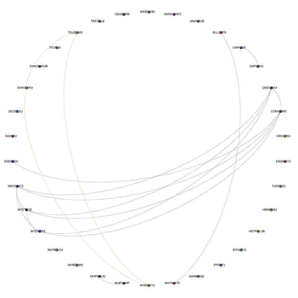
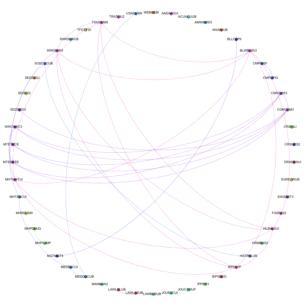
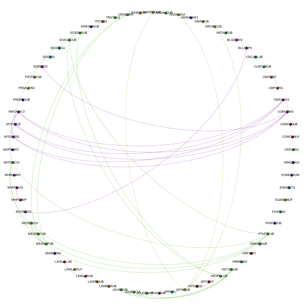
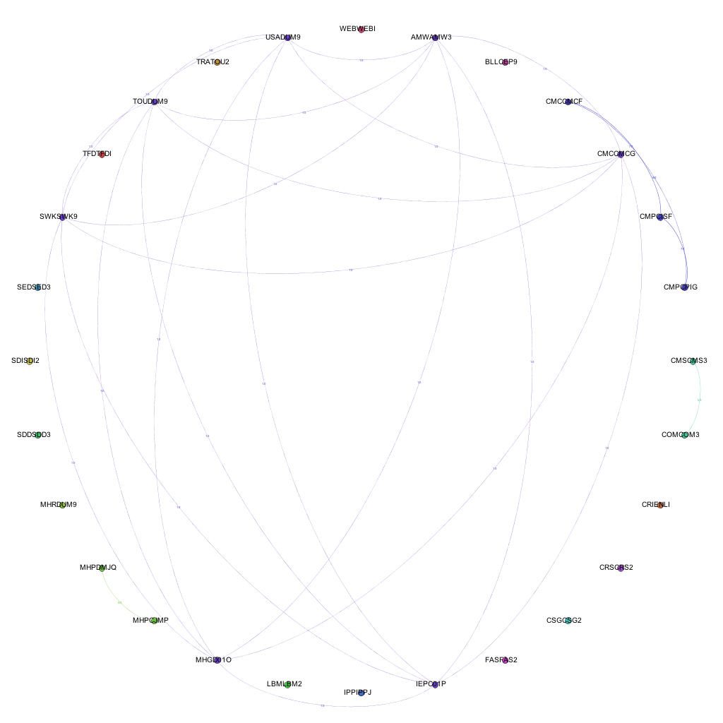
As mentioned in a previous post, there are many statistics that can be derived from the network visualizations that I have been generating from the course data I have been collecting. At the moment, these are the particular numbers that I have been paying attention to:

  • Mean Degree of Nodes – The mean amount of connections per node on the graph.
  • Mean Weighted Degree of Nodes – The mean weight of connections per node on the graph.
  • Graph Density – A ratio of the number of edges per node to the number of possible edges.
  • Modularity – a measure of the strength of division of a network into modules. Networks with high modularity have dense connections between the nodes within modules but sparse connections between nodes in different modules.
  • Mean Clustering Coefficient – the degree to which nodes in the graph tend to cluster together.

So, in terms of applying these to the networks generated with awards data:

  • Mean Degree of Nodes – The mean amount of connections for each award. i.e. the mean amount of awards that each award is connected to.
  • Mean Weighted Degree of Nodes – The mean weight of connections for each award. i.e. the mean amount of modules shared by that award with other awards.
  • Graph Density – The amount of connections per award when compared to the total amount of awards in the network. (more affected by an increase in awards offered than others)
  • Modularity – a higher modularity suggests that awards are very highly connected with specific other awards, but have very few ‘odd’ connections to other awards in the network. A very high modularity would suggest that a group of awards shared a lot of modules between themselves.
  • Mean Clustering Coefficient – a low coefficient would suggest that awards did not group together, and therefore did not share modules between them. A high coefficient would suggest that most of the awards in the network formed clusters with other awards.

The numbers generated for the weighted connections between awards for the academic year 2006/07 through to 2012/13 are as follows:

Academic Year Mean Degree Mean Weighted Degree Graph Density Modularity Mean Clustering Coefficient
2006 – 2007 0.804 1.821 0.069 0.657 0.357
2007 – 2008 0.763 1.711 0.041 0.726 0.408
2008 – 2009 0.500 1.324 0.030 0.588 0.224
2009 – 2010 0.405 1.432 0.023 0.574 0.124
2010 – 2011 0.720 1.880 0.029 0.777 0.212
2011 – 2012 0.716 2.486 0.020 0.810 0.259
2012 – 2013 0.651 4.349 0.021 0.847 0.267

So what do these numbers show and are they actually useful? Well….

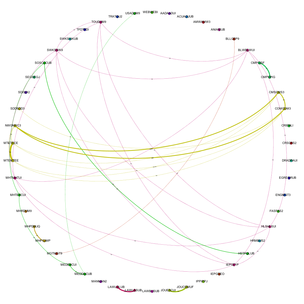
Mean degree shows the amount of awards that each award is connected to, on average. If we look at mean weighted degree instead, we then take into consideration the weight of a connection between a pair of nodes, i.e. the amount of joins between them, rather than just the fact that a join exists. Plotting this graphically helps to show the pattern that emerges.


Mean weighted degree of awards, 2006/07 - 2012/13

From the graph above it becomes clear that there is a definite drop on MWD (mean weighted degree) from the academic year 07/08 to the year 08/09 (around 22%), showing that the average amount of links between awards dropped fairly considerably. Through looking back at the university’s history, this can be explained as this was the point in time that the amount of points per module of study was altered, meaning that, essentially, multiple version of the same award were running in tandem: some with the old weighting of awards, some the new. This also explains the steady increase in MWD up to 11-12 which is the first year that the old weighted degrees would not have been active at all. From the highest point of the old weighting, to this point in the new weighting, there is an increase of over 36% in the amount of joins between awards offered at the university. This shows that (assuming an increased modularity is good in terms of curriculum design) that the provision has been improved through the alteration of module weightings. Taking into account the overall increase in the amount of awards offered, this also shows that the restructuring of the modules had a significant impact on the sharing of teaching and assessment across different awards.

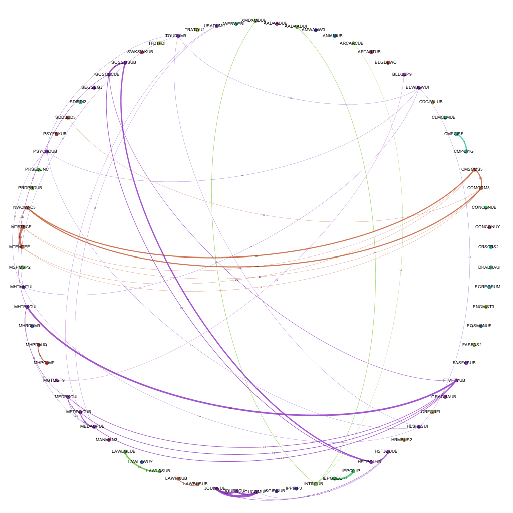
The number given for the ‘modularity’ of the graphs shows a couple of interesting things.

Modularity values for awards, 06-07 to 12-13

As noted above, the modularity shows how well the nodes on the graph (i.e. the awards) form into self contained clusters. A value of 1 would suggest that the awards form perfectly into self-contained clusters, having lots of connections between themselves but no connections with other clusters, a value of 0 would suggest the opposite. As you can see from the graph above, in 06/07, the modularity was reasonably high, quite possibly due to the smaller amount of awards offered at the university. This figure rises over the next year, and then drops for two consecutive years as the weighting of modules at the university goes through a period of change. As the change is fully implemented, the modularity rises significantly and continues to rise, almost at a constant rate from 2010-11 through to 2012-13. This would suggest (though is not necessarily the case) that, either by design or good fortune, the awards offered at the university are starting to form into self-contained groups or areas of specialism. This is interesting to note, as the university has recently gone through an organizational restructuring whereby three colleges were formed – could these clusters be contained within the colleges?

Though this has only looked at two series of numbers generated for each of these visualizations, it does show that visualizing course data produces extra data that cannot be collected when the data is in its raw form. Further to this, it also shows that this data accurately reflects historical changes in provision within the university. If these principles can be applied retrospectively to show changes, in which ways can they be applied to decision making processes, to help assess the impact of potential changes?

Back to Visualizing Course Data!

After having worked on creating a badge system for universities over the past few weeks, I’ve now gone back to looking at how the massive amount of course data that I currently have can be visualized in a meaningful and useful way.

My first bout of visualization resulted in a series of A0 posters showing the links between all of the modules currently being delivered at the university. Whilst these visualizations are very useful for showing the complexity of course structure and relationships, it becomes fairly difficult to extract any information that is particularly useful. For example, the edges in the network denote a connection between two modules in terms of the award that the combination is delivered on. A collection of edges of the same colour show a group of connections for the same award, i.e. a group of modules delivered as part of one particular award.

As the next step in my on-going quest to make sense of all of this course data (and related datasets), I’ve decided to look at a different abstraction of the same datasets, this time looking at the connections on an award level. This is one level of abstraction higher on the scale of University -> College -> Faculty -> School -> Award -> Module. By changing to this level of abstraction, it means that a) there are far fewer nodes on the graph, making it easier to see the information and b) it is easier for people to relate to an award (i.e. more easily recognizable what the node is referring to) than it is at a module level. At the moment, the visualizations are considering data for awards that are ‘Active’ i.e. have students on all levels and have a full-time, ‘traditional’ degree ‘feel’. I chose to do this as taking into account awards that are on their way in or way out, and part-time variations on a theme offered in a full-time course started to distort the data, flooding the networks with nodes and edges that are essentially replicas of other nodes and edges in the graph. Obviously the visualization exercise could be repeated for part-time or post-graduate courses, or to include them.

Narrowing the data down as described above, and running it through the trusted Gephi, this time using a circular layout algorithm, produces visualizations such as the following:

Links between awards for 2006-07


Links between awards for 2009 - 10
Links between awards for 2012 - 13

Each node around the edge of the graph represents an award that was active at the university for that particular year. With the university being relatively young in the grand scheme of things, the time-span between the first visualization (06-07) and the final (12-13) represent a substantial proportion of the university’s (in its current form) history. Award codes have been used as they are fairly short and remain similar in groups of awards offered by the same departments or schools. By doing so, the relative position of awards is more or less maintained in each visualization. For example. the pattern created between Computer Science awards and Media awards exists and can be easily spotted in each of the visualizations, even though the amount of awards in each visualization changes and the exact award codes of each award code may change. The full collection of visualizations can be accessed here: 2006 – 2007, 2007-2008, 2008-2009, 2009-2010, 2010-2011, 2011-2012, 2012-2013. These visualizations show three different sets of information: the amount of active awards for each year, the codes for the active awards and the relationships (where they exist) between the awards, i.e. where they share modules in common.

By taking into account the amount of modules shared between the awards and including this in the visualizations, we get a different view of the data. We can not only see where links exist, but also the strength of the links between the awards. Including the amount of modules shared between awards as the weight of each of the edges produces the following visualizations:

Weighted joins between awards 2007-08
Weighted joins between awards 2009-10
Weighted joins between awards 2012-13

The full collection of these visualizations can be found here: 2006-07, 2007-08, 2008-09, 2009-10, 2010-11, 2011-12, 2012-13

By introducing the weighted edges into the network, we can learn new pieces of information through the visualizations. Whilst the Computer Science – Media pattern exists across several years, we can see it move from being one of the more dominant links (2007-08 / 09-10) to being overshadowed by the amount of modules being shared by, for instance, Film and Television and Media Production and History & Social Science awards.

As well as making pretty pictures with the course data, the statistics associated with these networks can also be analyzed, but that will be the focus for my next blog post.


Designing a Badge System for Universities

Over the past week or so we have started looking at the Mozilla Open Badge platform and how it could, possibly, be applied to use within HEIs (and beyond). It started to become apparent, through reading other peoples blog posts and reading through mailing lists, that there is already some work going on to award badges for completion of modules of study or achieving particular learning outcomes. After looking at what information is required to award a badge using the Open Badge framework, I created a design for a platform that can be picked up and used within another institution or context with minimal customisation required. The purpose of this blog post is to document the decision processes involved and to describe and show the resulting design.

The Basics

The basic premise of the system is fairly simple: create badges and award them to individuals who meet the criteria for each badge. These awarded badges can be ‘baked’ (to include the relevant information) and sent to individual’s ‘backpacks’ – be that the OpenBadge backpack or an internally hosted version.

This suggests that data pertaining to the following is required: Badges, Objectives and Earned Badges.

Adding A Few Extras

If the objectives required for badges are to be at least based on outcomes of programmes of study (be that at a full degree award level, or one constituent module within a degree), then it may be necessary, or at least preferred, to categorise the objectives within the badging system, or to add types of objectives to the system. Programme outcomes, if taken from our own programme specification documents can be split into at least three different types: Knowledge and understanding; Subject-specific skills and attributes; Transferrable skills and attributes. However, this categorisation of objectives may not hold true for other HEIs that may wish to use this code, and almost certainly would not be applicable if the code was used outside of the education sector. So objective types also have to be stored within the system.

When considering (still within a HE context) how the badging system might be expanded beyond learning outcomes of programmes or modules, you begin to open up the potential of including other data sources into the mix, such as library data, participation with extra curricular activities etc. For this reason, I’ve also included a badge source to the data, so that badges can be awarded from different sources and be differentiated as such through the data and its presentation to users. Again, another group of data to be stored: the source of a badge.

Designing the System

Data Requirements

Firstly, a list of the data required within the system:

  • Objectives for badges
  • Badges
  • Badges earned
  • Source of badges
  • Types of objectives

Doing the whole relational database thing on the data results in a structure something like:

  • Objectives
  • Objective Types
  • Badges
  • Badge-Objective Links
  • Badge Sources
  • Completed Objectives
  • Awarded Badges

A quick Entity Relationship Diagram (including suggested links to possible external data sources) would look something like this:

An Entity Relationship Diagram for a Badge System
ERD for a badge system


Obviously this data structure and suggested ERD is subject to change as I go through the development and prototyping stage.

With a data structure in place, mapping out the flows within the system and designing and implementing the APIs to do the data input and output are the next two steps in the process!

Data & Process Flows

There are several obvious functions that must exist within the system to allow the awarding of open badges to individuals. These functions include:

  1. Storing badge information
  2. Storing objective information
  3. Storing objective types
  4. Linking badges and objectives
  5. Storing various sources of badges
  6. Tracking objective completion for users
  7. Checking badge completion
  8. Storing completed badges for users
  9. Creating assertions for completed badges
  10. Presenting badges to a user through email
  11. Sending badges to a user’s backpack

In order to make the system compatible with existing data sources outside the bounds of the system shown above, the following API functions will need to be externally accessible:

  1. Add badges to the system
  2. Add a new badge source
  3. Add objectives to the system
  4. Add objective types to the system
  5. Uploading a badge image to the server
  6. Mark objectives as completed
  7. Search for existing objectives
  8. View completed badges for a user
  9. View completed objectives for a user
  10. View existing badges
  11. View existing objectives
It should be noted that these lists are only indicative of the functions to be offered by the system and will probably change while I’m developing it.

A quick data flow (ish) diagram shows how the data may flow internally within the system and the data that may be required from external sources, for one of the main series of functions – marking an objectives as being completed, through to awarding the badge to a user.

 What Next?

Firstly, I need to put together a prototype of a system that resembles the one described above. The code will be available on GitHub and licensed appropriately for reuse. Then we need to decide how we *may* go about prototyping the use of the system and any further development that is required. There is no agreement to go beyond the research and prototyping of badges at Lincoln yet and the most likely use case is for awarding badges for extra-curricula achievements, such as participation in workshops and those identified by the Higher Education Achievement Report (HEAR).

How Not to Visualize Course Data

This blog post will probably be the first of several, detailing what hasn’t worked in terms of mixing various datasets and the resulting visualisations. We learn from our (and other people’s) mistakes, as well as our successes, after all!

As mentioned in a previous blog posts, one of the other datasets that the University of Lincoln makes available through data.lincoln is space data – relating to rooms, buildings and campuses. As I have been able to determine which courses are offered by which departments, I decided to see how this visualisation would work when overlaid on a map of the campus. Frankly, it didn’t work very well.


Map showing sharing of modules across campus

Whilst knowing that various departments are sharing modules, which may show the teaching of interdisciplinary courses, is a good thing, representing this data on a map doesn’t work very well. The first problem that arose is where to situate each department. Obviously each department has a building that it is based in, but the teaching of the courses offered by the department may spread across different buildings, and even different campuses. To simplify things, I placed each department within the building in which it is primarily based. Secondly the weight of the line represents the amount of courses and/or modules being shared across departments.

The result? A mess of lines that don’t really show anything meaningful. As staff and students won’t necessarily be involved in lectures in the building in which the department is based, it doesn’t show movement across campus or anything tangible. It’s not the buildings that are related, but the courses and modules organised and run by the people that work in the departments that are (more or less) situated, or at least based, within the buildings. Further to this, because of the nature of how close together the buildings on the Brayford campus are, mixed with the distance between the Brayford campus and Riseholme, if you zoom out to see where the red line to the left of the image above ends up, you get a line between the two campuses, and a big red blog on the Brayford campus, which makes it even more difficult to gain any information whatsoever from the visualization.

So, it is safe to say that, at least in this particular context, mixing course data with space data and overlaying it on a map doesn’t work overly well. It may be that that when combined with, perhaps, timetable data, and done on a more granular level, perhaps just showing modules within one award, that overlaying the information on a map would be more suitable; but in this particular case, the visualisation of the data leaves a lot to be desired.

What to Do with Six Years of Course Data?!?!

After asking colleagues in Planning, I came across some stored reports that contain information about the various awards/courses offered at the university, along with the modules that constitute those awards – from short certificates to full undergraduate and postgraduate degrees. Whilst the reports date back to the 90s, the data within them is substantial enough to be used from 2006-07 onwards; in total this comes to around 50,000 individual award->module relationships spread over the 6 academic years represented in the data.

The first question that arose was: ‘What to do with six years of course data?!?!?!’.

After speaking with Tony Hirst last week, we came to the conclusion that this data would also have a great benefit if utilised in new ways within the university itself, as well as presenting the course information (and related datasets) to current and prospective students. The first way I decided to look at all of this information was to visualise the relationships between modules and courses offered at the university.

The data shows how different awards share certain modules in common; this can be seen in small-scale examples within the raw data itself, but how would the entire dataset for a year look? To find out, I extracted the pertinent information from everything that was currently being stored, and eventually narrowed it down to a set of data that showed the relationships between modules – basically pairs of modules offered on the same awards. Modules formed the nodes of the graph and the links between the nodes – the edges, are representative of the various courses that the modules are offered on.

With this dataset prepared, I loaded the data into Gephi, selected an appropriate layout algorithm and let Gephi work its magic. As a result, we get graphs like this: allmodules_11_12. (Each node is a module, each edge is an award that the module is available on, edge colours represent a single award). From these graphs we can see that clusters of courses form that share many modules in common, mainly around joint degrees (which makes sense!); we can also see that many courses ‘float away’ from these hubs as they are entirely self contained and share no modules with any other award offered at the university. The other graphs can be seen here: all modules 06 07all modules 07 08all modules 08 09all modules 09 10 and all modules 10 11.

So apart from making pretty pictures with course data, what purpose has this served? Well, firstly, I now know that I can get a vast amount of data covering the past six years of course and modules offered at the university. Secondly, I now have a better understanding of the inner workings of Gephi, which will no doubt serve me well over the rest of the project. Thirdly I also now know just who to pester in the right departments to get even more data. Finally…..we now have A0 printouts of these graphs plastered around the office walls – I certainly didn’t envisage using course data as wallpaper when I started on this project.

Being able to quickly see the connections between modules, particularly where one module is used for multiple awards could be very useful for those involved in curriculum planning. Obviously I’m not suggesting that they consult one of these A0 posters to assess the impact of changing one module, but being able to quickly find the impact of changing it would be useful. Take for instance, a module that contains an element of group work. 5 courses use this module, 4 of which are run by one particular college, the 5th course is run by a completely separate college. 4 of the courses have far too much group work, it is decided, so the decision is made to remove the group work element from the module. Do those involved in the decision know that the module is used by a course in College B, and, that the module is the only element of group work within a year’s study on the course? Removing the group work element would mean that the course doesn’t contain all of the required elements to be re-validated, obviously causing problems further down the line. Combining the data used to produce the visualisations above, along with other datasources could help to resolve this issue.

So where to go from here? Well, abstracting slightly further from the course->module level, we (I) can start to compare inter-departmental and inter-disciplinary sharing of modules at a department, faculty or college level within the university. Combining with other data that we make available through data.lincoln, we can look at how departments share modules across the physical space of the campuses that make up the university (more on that in another blog post). Combining the data with student numbers, we can look at the subscription levels to the modules that form a focal point to multiple awards. If / when I can get hold of full datasets for learning outcomes & module descriptors, I can start to look at modules that don’t necessarily share any course in common, but may be similar in terms of the learning outcomes they address or the topics they cover (as described in the module descriptions). There really are many ways to combine all of the information that I’m starting to stumble across and it is just a case of finding interesting combinations of datasets and assessing how useful the results are.

As a result of this digging around and tidying up of various data sources, all of the data that can be made accessible through data.lincoln will be made available – in a nice format, unlike the multitude of document types and messy data that I’ve been dealing with recently.

Any suggestions of ways to mash-up some data or ideas about new visualisations, feel free to leave me a comment or three below!